Tuesday, 23 April 2013

Landscape: Exterior Landscapes

The drawing was complex due to all the bricks that are used for the buildings and the base of he fountain so there are a few lines to show them without obscuring the focal point which is the left side of the building in the middle. The line of the drawing allows the eye to see the entire drawing from either side of the fountain and up the building. The landscape is in the rule of thirds  because the focal point is directly on the rule of thirds which makes the composition more pleasing to the eye and the eye can follow that line from there which adds to the composition. The building which has the focal point is modern which comes from modernism. This is relevant because the buildings form has been simplified for the drawing.

The levels of detail in this drawing is good because the foreground which is the fountain has adds depth to the mid-ground which balances the composition making the drawing pleasing to the eye. The  midground is where the main focal point is and because of this has the most detail.The background has a slant which goes inward to the midground which helps the eye to focus on the focal point.  The composition of the landscape is good because the arrangement all the buildings makes the composition more interesting  because  everything focuses into the midground because of the lines.

Thursday, 18 April 2013

Landscape: Classical Interior achtitecture

The layers of detail in this drawing makes it look like it is a more real interior. The mid-ground is the inside of the archway because that has the most detail and feels like it is the focus of the drawing. The Background is the stairs and the floor further back which helps the image not look like it just ends at a void. The Focal point of this image is the wall just before the stairs. This is because of the alcoves in the wall and the shading on the stairs which attracts the eye.The focal point is more interesting because it it on the rule of thirds meaning it is not directly in the middle which would have made the image look like it is to symmetrical which would have made the image boring for the eye. There is a little bit of impressionism for the floor as without some detail the drawing would look like it is floating which would break the rest of the image.

As this is an interior landscape there are multiple light sources one is looks to be from the back and the other from the light at the top this means that there are not a lot of shadows can be cast. Due to the textures of the stone used the shadows would have made the drawing softer and will make objects less distinct. The impressionism in the drawing was used for the archways as they only have a couple of scribbles to show that the archways have a design carved into it. This was done because it would have taken to long to get the designs as they are and the complexity of it would have distracted the eye from the rest of the drawing.

Monday, 25 March 2013

Figure: Non-Human Anatomy

This drawing of a duck has it's head turned which defines the neck and all the body. This also makes the drawing stronger and more dignified because it was not humanized. The darker shading on the body gives the sense of roundness  that the curve gives. The pose of the figure is static as the duck would be able to stay like that for a while however the pose does also look like the duck is alerted to a noise.The figures form is closed because the wings are very close to the body and the focus is focused inwards due to the way the legs are going up into the body which is then followed by the dark shading going upwards.

The lines capture the animals personality well on the top and on the bottom of the animal. This is because both of the lines are angled in a way which makes the pose look like the movement was sudden as it goes from the head. The balance in the drawing goes from the spine down the leg because the animal is standing up and the balance has to be there for the duck to be able to stand up right. The relative scale of this drawing is good because all the parts of the animals body were measured from the head so both the vertical and the horizontal measurements are correct and in proportion. 

Figure: Movement


This drawing effectively shows that the person is moving due to the change of the pose. The curve of the figures spine changes as the arms push back the stick, as that happens the head angles down which also shows that this figure is moving. The balance of the figure is helped by the stick and the positioning of the hands on it. The positioning and proportion of the feet helps give the body of the figure balance because they are not  too large making it look unrealistic or too far making it impossible for the figure to stand.The figure starts in and open form because of the arm being stretched out however as the figure moves the it starts to become more of a closed form due mostly to the arms coming on to the body. This is a dynamic pose due to the movement of the stick which at the start the eye can see the stick will be going back as the figure moves forward.

The proportion and relative scale in this drawing is good vertically because all of the figures limbs have been correctly measured by the head. however there is a problem with the horizontal measurement as the arm on the right which is reaching down is too far down and should be closer to the torso. The angles in this drawing are vital because they show the movement between each drawing. The angles on the arms are the most important because the stick is the thing that is always in a different position  in each drawing, without the angles the middle and the left drawings will not be accurate with the drawing on the right.  The axis of the figure was defined by the spine which also shows how the shoulder are with the stretched arms. This  was drawn externally which could explain the horizontal proportion. Instead of drawing the contour of the figure an internal approach  which shows the direction of the ribs and pelvis would have  helped to capture the pose in each drawing which would show how the figure is moving.

Figure: Balance and Weight


The figures pose is more static because the curve that the spine and the stretched arms gives the impression that the figure is resting on a box and there is no sign of possible movement. The black & white shading is supposed to make the figure look 3 dementional while using the contrasting colours to show the how the light hits the figure. However the black shading on the legs do not have the same effect it tricks the eye.The proportion of the arms and the legs are correct due to the measurements of head. The weight of the figure is on the legs and along the back and the figures arms are hanging  and as the figure is standing up. The gesture is ok because the eye is able to tell that the hands are resting on something and there are no limbs in any painful unnatural position.

The main axis of the body is clear because of the quick stroke used for the spine which also has the indication of the shoulders. The external approach to drawing this figure was used so the lines are supposed to be long and flowing as they are the contour of the figure. The drawing could have been better if it was done with the internal approach as that would show the skeleton and the direction of the spine and limbs, which will also be used to indicate how the pelvis and the ribs which should be good enough to capture the pose. The balance & weight in the drawing is good because every muscle in the figure has been drawn so that the figure looks like it is not going to fall down. The gesture in this drawing is ok because the angle of the back shows that the figure is bending down while the shape of the hands and the bend in the knees all show that the figure is leaning on a object. This makes the drawing look more alive and less boring.


Figure: Anatomy Refresher


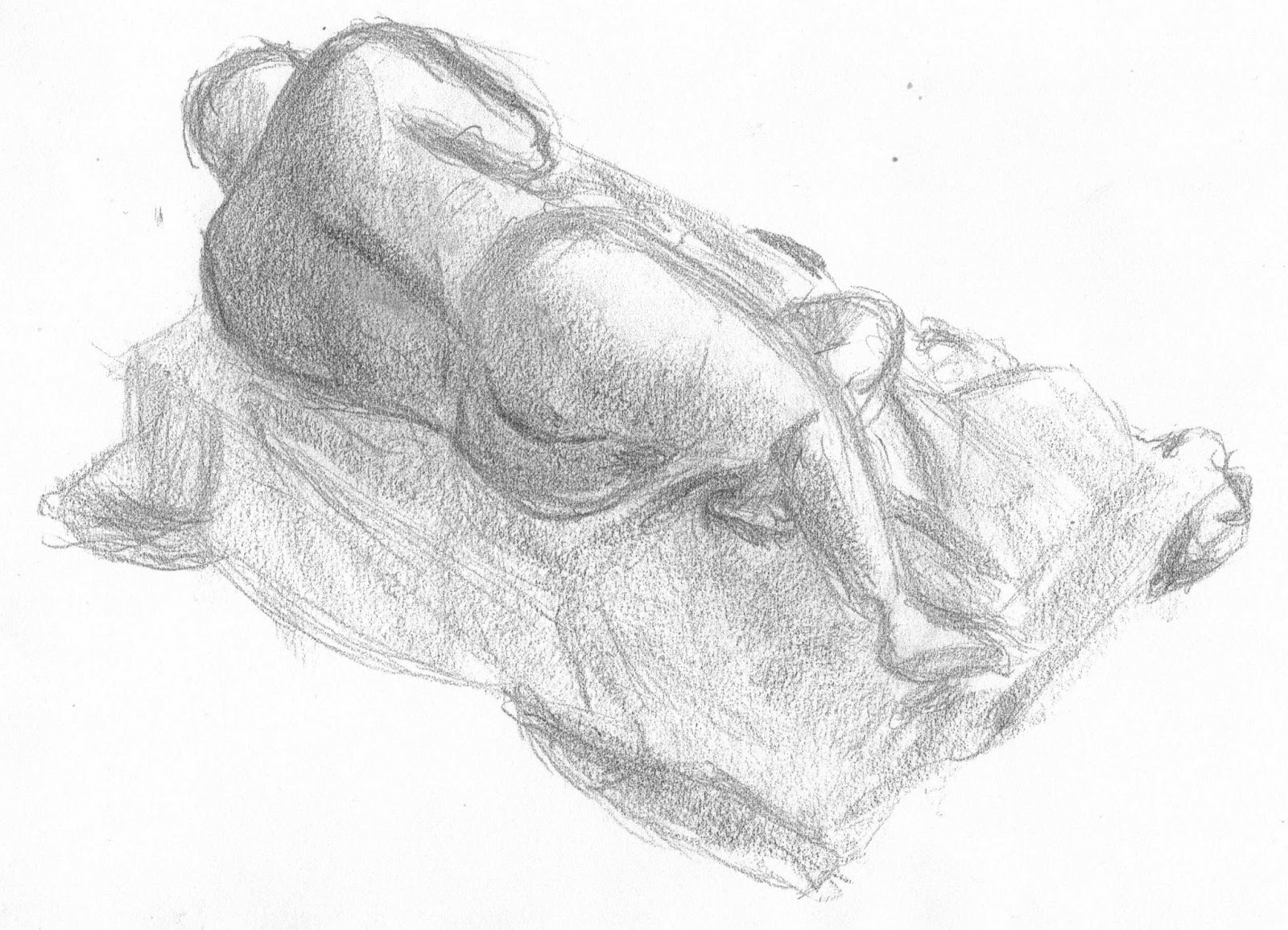
The anatomy is good as the cranium is shaped right and the foreshortening on the clavicle is ok which makes the angle of the figure ok. The Humerus is ok and in proportion however the Bicep might be a little small. The Femur, Tibia and the Fibula are in proportion and the muscles surrounding them are not  to large to make them unreal.This is a static pose as the figure is lying down on the mattress and the figure can be in this pose for a long time. The gesture in this drawing is important because without the leg being bent up and held up from the foot. If that knee was not higher then the rest of the figure the drawing would loose life and it would be a lot less interesting for the eye.

There is a real sense of depth for the legs mostly because of the shading on the back of the leg and the on the drapery underneath the knee which really adds to the drawing. The ankle also gives depth to the foot which brings out the foot and makes the figure more realistic.The relative scale of the drawing is strong as the everything looks to be measured to the size of the cranium vertically and horizontally meaning that the anatomy of the figure is correct.

Figure: Foreshorterning

The drawing has been planned well on the paper as the image fits with the angle that the skeleton was positioned. The foreshortening in the image is ok because of the faint blocks used to construct the bones however the back of the cranium does not look right because it looks like the jaw is sticking too far.The proportion on the Ribs looks off because it feels like it is not connected to the pelvis and it is pushed out. The form of the bones looks ok as the eye is able to see the curves that are on the skeleton however some bones like the Fibula could be more visible in the image.If some impressionistic techniques were used the on the skeleton the complexity of the ribs could look like it is connected to the Sternum without making that part of the image look a mess which would distract the eye from the rest of the drawing.

The overall proportion & relative scale of the body to the cranium is ok as ribs are vertically in proportion and is horizontally in proportion. The pelvis and the legs are all measured to the scale of the cranium  the same goes to for the arm. There could be a better sense of depth on the ribs just so that it does not look like there is a lot of lines and give the impression that there are bones. There could also be a better sense of depth on the Ulna, Radius, Tibia and Fibula as these bones are close together the on the legs and the arms and in the drawing they merge almost so they could have a little bit more space between  them and they could also have some shading to show that they are separate from each other.